These are the things you need to know about our webpage update
Friday, December 15, 2017 - 12:43
Throughout the year, we have gathered experiences and suggestions about our webpage – what are the things our visitors are interested in, how they are using the site and which parts could be improved. We took all this information and realised many improvements in one go. Read below to find out more.

Programme description
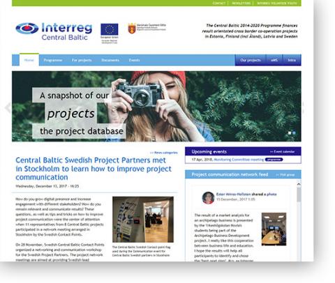
One of the comments we have been getting is that the meaning of the programme is not clear on the landing page. To improve on this, we added a simple one-sentence description of the Central Baltic.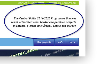
External services
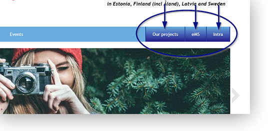
There are three services/web portals maintained by the programme that require you to leave centralbaltic.eu or perform a separate login. These are: the eMS, our project database and Intranet documents. All of these are now grouped at the right side of the main menu bar. Also, the database is now called ‘our projects’ as it is more descriptive in regards of the content found at database.centralbaltic.eu.
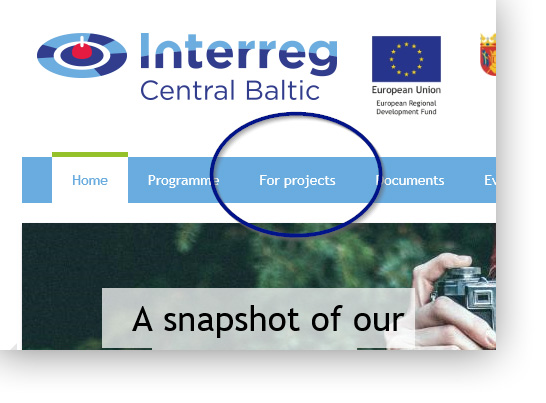
'Projects' is now ‘For Projects’
As all information about ongoing projects is concentrated into our project database, we are developing the webpage section called ‘Projects’ towards a place for existing projects to find relevant information – such as the FAQ section. This work is ongoing and will continue it January.
Newsletters
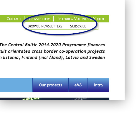
Previously, our newsletters were distributed in two different places on the website. We moved bthe subscription possibility into the green top bar, where the newsletter archive has been residing.
Events
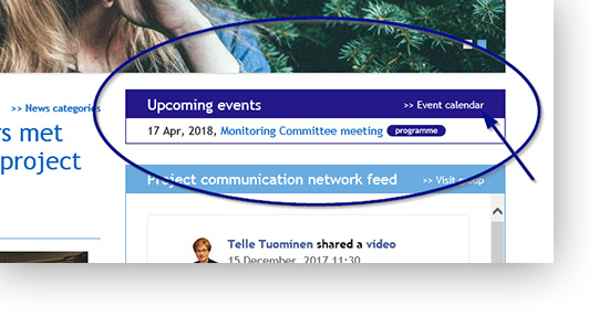
Previously, our upcoming events were hidden behind the news on a separate tab. In order to show them better, we created a separate block that shows upcoming events right on the landing page. As added functionality, there is a separate category for projects to add their events as well. We will provide more information about this feature in the near future.
Project Communication Network -group feed
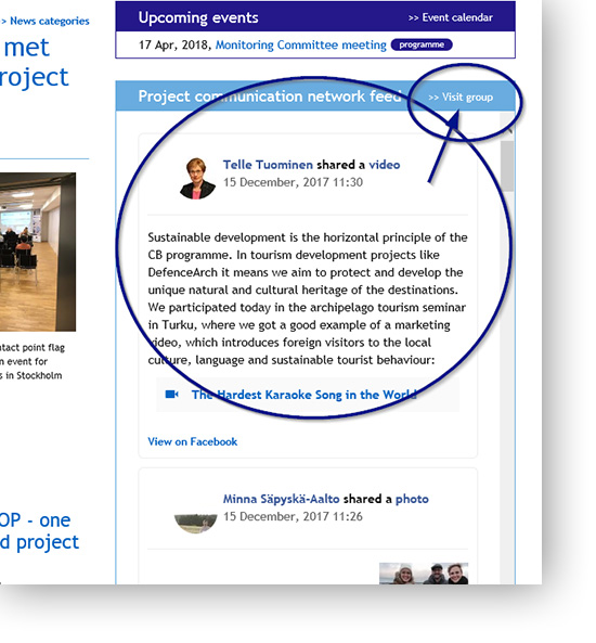
Throughout the year, the Project Communication Network for projects has been very active, with peaks at more than three posts a day. We have been getting loads of positive feedback about the group, as it provides a very nice momentary snapshot of what our projects are doing right now. However, there have been many complaints as well that the group is hard to locate. To improve on visibility, we added the stream right on our landing page, thus enabling all webpage visitors to gain an instant look at our activities over at the group.
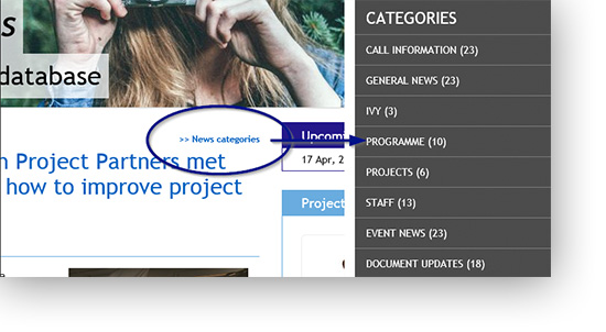
News
We have a lot going on in the programme. Sometimes more than one important news piece get published within a few days. This leads to a situation, where older news got quickly buried into the right side list. To improve on this, we gave older news more space directly below the current main news. Also, with a steady flow of news, a need to better categorise them became apparent. Thus, we added new news categories and made them easily accessible from the landing page.