Remember to check your references!
Wednesday, December 14, 2016 - 11:10
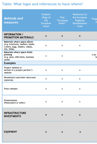
We now have a large number of implementing projects, many with their own webpage. It is worthwhile to remember the importance of showing the right references in the right place. This article gives a short overview regarding the matter. To learn more, the two sources to visit are the Programme Manual and the Guide for project communication. The latter hosts an excellent overview table of required references!
When thinking about communication measures (including project websites), you need to list at least the following references:
When creating a website for the project, It is very important to remember that the EU flag as well as the textual reference have to be shown in the correct way: “Websites created with funding from the Central Baltic Programme 2014-2020 must contain all the above-mentioned references to the funding source at the start/main page. The EU flag, in colour, and text “European Union” must be displayed on the front page without the reader having to scroll.”
Not only is it important to have the right logos in the right places, their size does matter too. The Programme Manual says the following about sizes and placement: “If there are other logos displayed in addition to the EU flag, the flag is to have at least the same size as the biggest of the other logos, measured in height or width. The placement of the above-mentioned references is to be well visible but can otherwise be freely decided.”
More information is provided also in the communication section of our FAQ and you can of course, always contact us as well.
When thinking about communication measures (including project websites), you need to list at least the following references:
- The flag of the European Union together with the textual reference “European Union”
- Textual reference “European Regional Development Fund”
- The logo of the Central Baltic Programme 2014-2020
When creating a website for the project, It is very important to remember that the EU flag as well as the textual reference have to be shown in the correct way: “Websites created with funding from the Central Baltic Programme 2014-2020 must contain all the above-mentioned references to the funding source at the start/main page. The EU flag, in colour, and text “European Union” must be displayed on the front page without the reader having to scroll.”
Not only is it important to have the right logos in the right places, their size does matter too. The Programme Manual says the following about sizes and placement: “If there are other logos displayed in addition to the EU flag, the flag is to have at least the same size as the biggest of the other logos, measured in height or width. The placement of the above-mentioned references is to be well visible but can otherwise be freely decided.”
More information is provided also in the communication section of our FAQ and you can of course, always contact us as well.


